Data Visualization – Choose the right one for meaningful insights
Modern dashboard software simplifies the fusion and visualization of data in a way that is as inspiring as it is accessible. However, while it is simple to do so, a great dashboard still necessitates some strategic planning and design thought.
Having a clear understanding of your target audience will help you identify the relevant data you will need. Once you know the story you want to tell, you can identify the data visualization type that best tells that story. Let's pretend you have all the relevant data and visualization software at your disposal. To proceed, you will need to select the correct charts and graphs. It is my hope that this post will be useful in your quest to develop better data visualizations and dashboards.
Before we dive into visualization methods, we'll conduct a questionnaire to help you choose the most effective types of visualization.
7 Questions To Ask Before Choosing Your Data Visualization Graphs
Choosing the right visualization charts for your project, strategy, or business goals starts with asking the right questions. The basic categories that distinguish these questions are:
- Relationship
- Distribution
- Composition
- Comparison of data
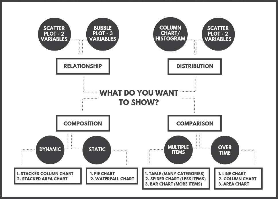
In order to give you further insight, we've selected the seven questions you should think about when starting your journey.
- What narrative would you like to tell?
To transform data into actionable insight, visualize data to tell a story. Using data to tell stories is an effective approach because it allows for data to be given context in a narrative everyone can understand.
You will be able to determine the data visualization types that are appropriate for your project or initiative by first deciding what kind of story you want to tell with your data and what message you want to convey to your audience. So, in the end, you will be successful.
- Whose story do you want to tell?
Understanding who your audience is is essential when choosing the right data visualization types.
Depending on your goal, you may be trying to communicate a trend or predictive insight to a team within your organization, or you may be aiming your data visualization efforts at a specific group of corporate investors. Make an informed decision about which data visualization chart types connect with your target audience by thoroughly researching your audience.
- Do you want to explore current trends in more detail?
Different data visualization chart types will suit differing goals, aims, or topics.
As you get more in-depth on your target audience and what kind of story you want to tell, you should then choose whether you want to deliver information about a particular trend over a predefined period of time. What will work best?
- Line charts
- Column charts
- Area charts
- Do you want to demonstrate the composition of your data?
When trying to showcase the overall composition of your data, picking the right data visualization types is critical in helping to ensure your message is not lost or diluted.
In these cases, the most effective visualizations include:
- Pie charts
- Waterfall charts
- Stacked charts
- Map-based graphs (if your information is geographical)
- Would you like to make a comparison between two or more values?
Although you can compare two or more trends or datasets in most types of visualizations, certain graphs and charts make your message even more powerful.
The best choice would be to show a direct comparison of two or more information sets:
- Bubble charts
- Spider charts
- Bar charts
- Columned visualizations
- Scatter plots
A better description of data visualization is that it consists of using your data to paint a picture rather than leaving it static in a spreadsheet or table. The techniques described in this article enable you to tell any story you want, regardless of the method you use.
- Does timeline play a role?
If you know if the data from which you want to extract value are time-based or time sensitive, you can select a chart or graph that gives you an instant overview of numbers or comparative trends over a given period.
In such cases, their logical, data-centered designs, functionality and characteristics are exceptionally effective:
- Dynamic line charts
- Bar graphs
- How would you display your KPIs?
Not only will this determine the success of your analytical activities, but also how clearly your visualizations or data-driven stories resonate with your audience.
Contemplate what information you want to gain from specific KPIs within your campaigns or activities, and how that information will be shared with others. Experiment with different formats until you find the graphs or charts that best fit your goals.
Here are two simple bonus questions to help you succeed with data visualization:
Do you compare data or show a relationship?
Do you want to show a trend?
Top 12 Most Common Used Data Visualization Types
Now that you understand the types of questions you should ask yourself prior to beginning your project (and there are numerous factors to consider when designing an aesthetically pleasing dashboard), it's time to focus on the 12 most popular types of data visualization to ensure your data is visualized in the most meaningful way possible.
- Number Chart
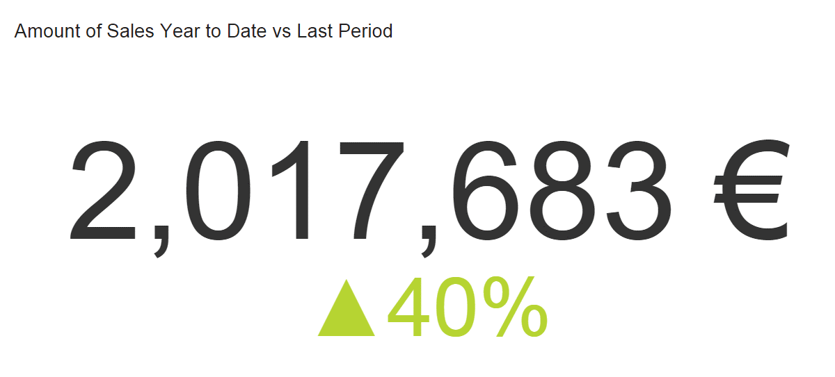 When to use Number Charts
It's like a ticker that gives you an instant view of a KPI. You can see totals like sales, evolution percentage, visitors, etc. at a glance. The only consideration is the time period you want to track. Is the entire history or just the last quarter desired? Labeling the period clearly helps your audience understand the story. It compares your number to the previous period (or to a fixed goal, depending on what you are tracking).
What to avoidNumber charts are often the first thing people see and read, so too many can dilute your narrative. Using too many can make your dashboard look flimsy. Limit the number of number charts to allow for more in-depth data visualization.
When using a trend indicator, compare data from the same period. For example, if you're tracking quarterly sales, compare them to last year's quarter (or last period, depending on your story). If you choose a target manually (perhaps you lack accurate historical data), set realistic goals to improve your KPI management. Remember to clearly label the trend indicator so your audience knows what they're looking at.
- Line Chart
 When to Use Line Charts
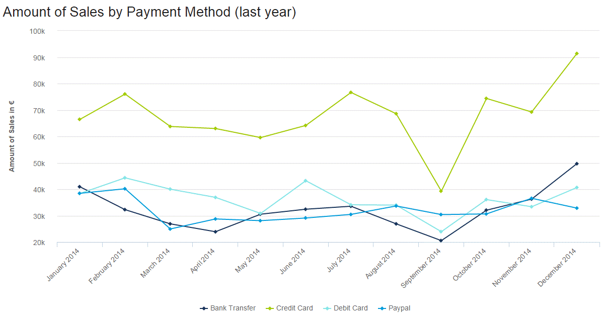
Line charts are used to show trends, accelerations, and volatility. They show changes in data over time. In the above example, we show all 2014 sales by payment method. Immediately, credit card payments were the highest, and everything fell in September. The takeaways are quick to grasp but deep.
What to avoidToo many lines (variables) can make your chart confusing. Your audience may also refer to the legend to remember which one they are looking at. If you have too many variables, consider a second (or third) chart.
Keep your layout numbers relevant. Keep your axis scale near the highest data point. When our highest data point is just over 90K, the y-axis would have been squished and hard to read. The data would have been crammed into the top half. Allow your data to breathe!
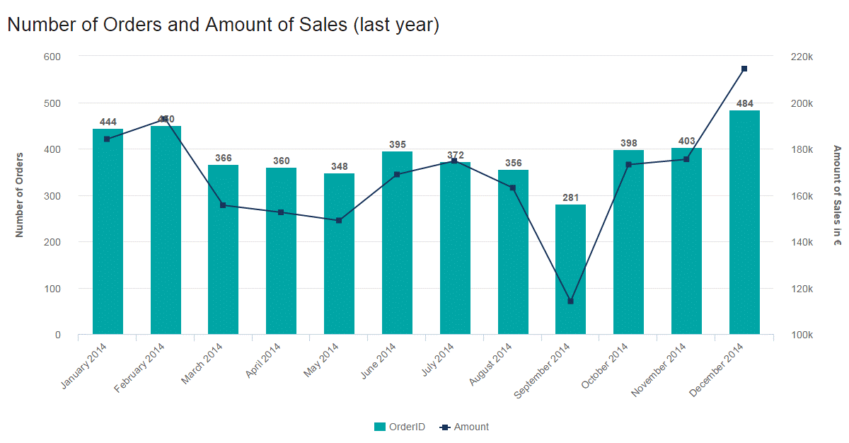
One more thing!Line charts can be combined with other data visualizations such as bar graphs. In one graph, you can show two elements of a story: a bar graph and a line graph. This graph shows orders (bar graph) and sales totals (secondary y-axis) (line). The metrics are useful separately, but together they tell a story.
- Maps
 When to Use Maps
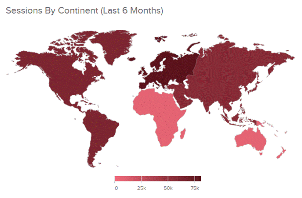
Maps are great at visualizing your geographic data by location. The data on a map is often displayed in a colored area map (like above) or a bubble map. Because maps are so effective at telling a story, they are used by governments, media, NGOs, nonprofits, public health departments – the list goes on. Maps aren’t just for displaying data; they also direct action. This was seen most recently through the Zika outbreak. Mapping the spread of the disease has helped health officials track it and effectively distribute resources where they are most needed.
Even if you aren’t saving the world from Zika, maps can help! For example, they are great at comparing your organization’s sales in different regions.
What to AvoidMaps are great at visualizing your geographic data by location. The data on a map is often displayed in a colored area map (like above) or a bubble map. Because maps are so effective at telling a story, they are used by governments, media, NGOs, nonprofits, public health departments – the list goes on. Maps aren’t just for displaying data; they also direct action. This was seen most recently through the Zika outbreak. Mapping the spread of the disease has helped health officials track it and effectively distribute resources where they are most needed.
Even if you aren’t saving the world from Zika, maps can help! For example, they are great at comparing your organization’s sales in different regions.
What to AvoidEveryone loves maps. However, that doesn’t mean you always need to display one. If the location isn’t a necessary part of your data-story, you don’t need a map. They take up a lot of room, so only use them when necessary. Also, don’t just fill your maps with data points. Clickhole did a good job of satirizing this common data visualization type by placing 700 red dots on a map. Filling your map with data points doesn’t tell a data story; it just overwhelms the audience.
- Waterfall Chart
 When to Use Waterfall Charts
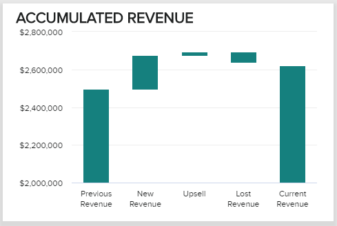
This extremely useful chart depicts the power of visualizing data in a static, yet informative manner. It shows the composition of data over a set time period, illustrating the positive or negative values that help in understanding the overall cumulative effect. The decrements and increments can cause the cumulative to fall below or above the axis at various points, causing a clear overview of how the initial value is affected. It is often used in financial departments and analytical purposes, usually depicting the changes in revenue or profit. For example, your MRR (monthly recurring revenue), new revenue, upsell, lost, and current revenue. In our example above, we can conclude that our current revenue increased in our set time period.
What to AvoidWaterfall charts are static in their presentation so if you need to show dynamic data sets, then stacked charts would be a better choice. Also, showing the relationship between selected multiple variables is not optimal for waterfall charts (also known as Cascade charts), as bubble plots or scatter plots would be a more effective solution.
- Bar Graphs
There are three types of bar graphs: Horizontal (left to right), Column (up and down), and Stacked (which can be either). Although all are in the same chart family, each serves a distinct purpose.- Horizontal Bar Graphs
 When to Use Horizontal Bar Graphs
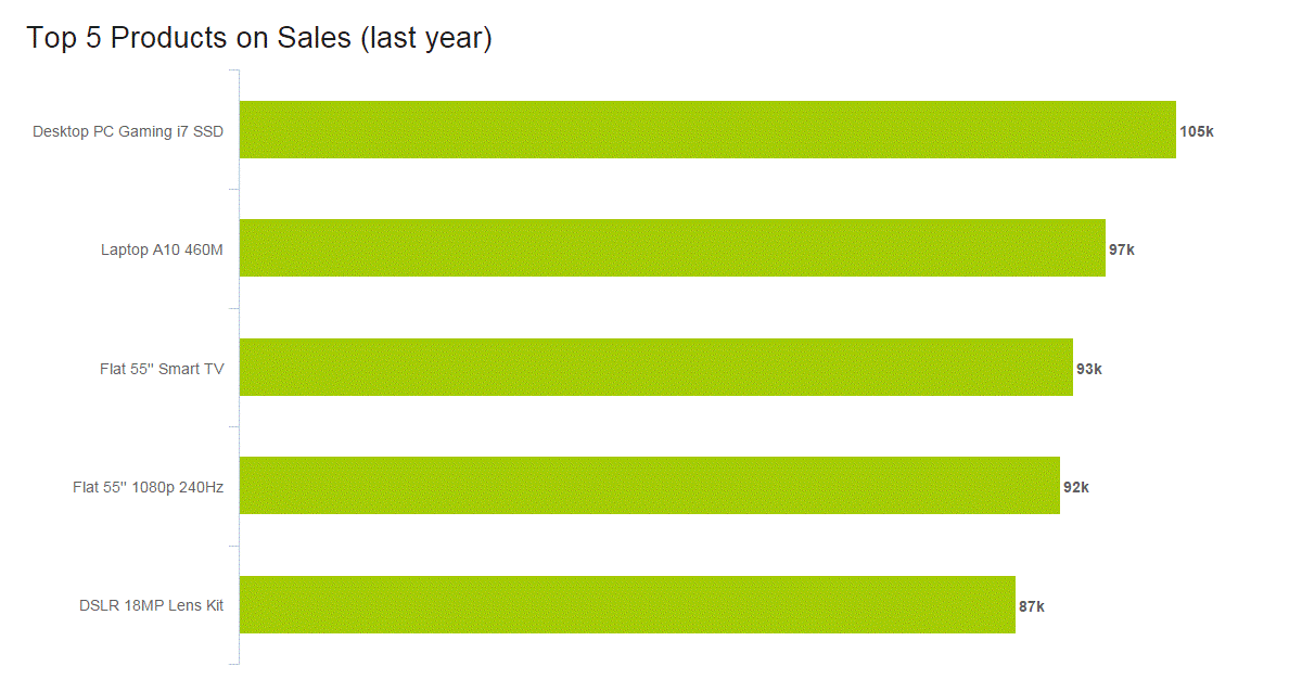
Horizontal charts are perfect for comparative ranking, like a top-five list. They are also useful if your data labels are really long. Keep them in an order that makes sense, though. Either list by value (like we did above) or, if that’s not the strength, choose a logic for the labels that makes sense, like listing them alphabetically.
What to avoidBecause time is best expressed left to right, it’s better to leave showing an evolution for the column chart. Also, like many charts, when you have too many values, a horizontal bar graph quickly becomes cluttered.
- Column Graphs
 When to Use Column Graphs
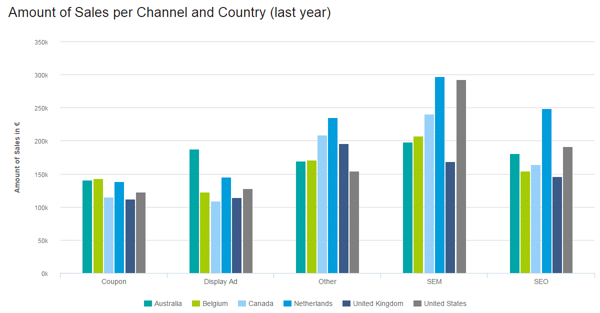
Column bar graphs are the standard for showing chronological data, such as growth over specific periods, and for comparing data across categories. In our sales data analysis example, Amount of Sales per Channel and Country (last year), it is clear that we are comparing six regions and five channels. The color coding keeps the audience clued in to which region we are referencing, and the proper spacing shows the channels (good design is at the heart of it all!). At a glance, you can see that SEM was the highest-earning channel, and with a little effort, the Netherlands stands out as the region that likely enjoyed the highest sales.
- Stacked Column Chart
 When to Use Stacked Charts
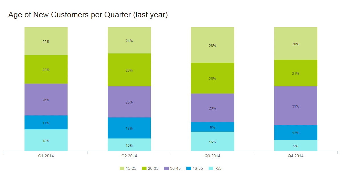
Stacked charts handle part-to-whole relationships. This is when you are comparing data to itself rather than seeing a total – often in the form of percentages. In the example above, the story isn’t about the total number of customers aged 15-25, but that 22% of the customers were 15-25 in the first quarter of 2014 (and 26% in Q4). The numbers we are working with are relative only to our total.
When showing single part-to-whole relationships, pie charts are the simplest way to go. Twenty-two percent of our customers are 15-25, leaving the other 78% to fit into the pie somehow. People get pie charts. They’re easy. But what if we want to show the same information over different periods? This would be a multiple part-to-whole relationship, and for this, we use a stacked bar graph. Again, we are telling the story of the percentage of customers in a certain age range, per quarter. The total number of each isn’t relevant here (although that information is used in the calculations). With proper spacing, we see each quarter clearly, and the color coding shows that overall, 46-55-year-olds are the most difficult customers to attract.
What to avoidAesthetically speaking, when you have too much data, columns become very thin and ugly. This also leaves little room to properly label your chart. Imagine we had 10 different age ranges per column. Some results, if not most, would be only slivers. To make your chart easy to understand, use good colors, proper spacing, and a balanced layout. This invites people to look at your chart and even enjoy it. A pretty chart is a much nicer way to consume data than squinting at a table.
- Horizontal Bar Graphs
- Pie Charts
 When to Use Pie Charts
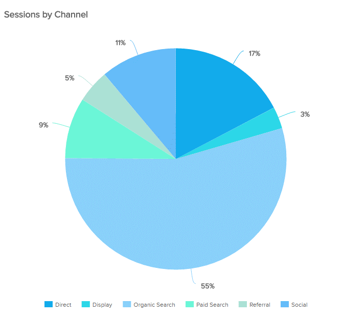
The much-maligned pie chart has had a bad couple of years. In fact, it has become pretty cliché to talk about how bad pie charts are. We understand the pie chart doesn’t do a lot, but it does do some things quite well. Pie charts are useful for when demonstrating the proportional composition of a particular variable over a static timeframe. Let’s look at some particular cases:
- When the parts add up to 100%: The “part-to-whole relationship” is built right into it a pie chart in an obvious way. At a glance, any user knows a pie chart is splitting a population into parts and that the total of those parts equals 100%.
- When approximating is okay: The pie chart is particularly effective when eyeballing values are enough to get the conversation going. Also, it’s easier to estimate the percentage value of a pie chart compared to, let’s say, a bar chart. That’s because pies have an invisible scale with 25%, 50%, 75%, and 100% built in at four points of the circle. Our eyes can easily decipher these proportions, driving conversation about what variables do and don’t take up most of the pie. Your audience doesn’t have to guess the proportions – you can easily add data labels or build the sister of the pie chart, the donut chart, to display additional information.
- When there aren’t many proportions to the variable or they are combined: Pie charts are great when answering questions like, “What two largest suppliers control 65% of the market?”
Your audience isn’t always going to be comprised of data scientists. Accordingly, your data presentation should be tailored to your particular audience. This brings us to another pie chart strength: people are familiar with pie charts. Any audience member will feel comfortable interpreting what the pie chart is presenting. As a bonus, circles generate more positive emotions: our brains like to look at circles over sharp corners. In the end, a pie chart simplifies the data story and encourages the audience.
What to AvoidData visualization guru Edward Tufte famously declared that “pie charts are bad, and the only thing worse than one pie chart is lots of them.” We already talked about the pros of pie charts and why we don’t adhere to this strict no-pie-chart philosophy. We should also state that there are plenty of instances where you should not use a pie chart. First off, pie charts portray a stagnate time frame, so trending data is off the table with this visualization method. Make sure your audience understands the timeframe portrayed and try to document or label this applied filter somewhere.
Pie charts are also not the best data visualization type to make precise comparisons. This is especially true when there are multiple small pieces to the pie. If you need to see that one slice is 1% larger than another, it’s better to go with a bar chart. Another thing about multiple pieces to your pie – you don’t want too many. Pie charts are most effective when just displaying two portions. They lose presentation value after six segments. After six, it is hard for the eyes to decipher what the slices proportion. It also becomes difficult to label the pie chart, and valuable online dashboard/reporting real estate is often wasted in the process.
This brings us to the last issue: circles take up space. If you are using multiple pie charts in a dashboard, it is probably best to more effectively combine the data in one chart. We recommend checking out the stacked bar chart for these cases. You can also have a look at the different pie charts that are commonly used and explore the disadvantages of pie charts.
- Gauge Charts
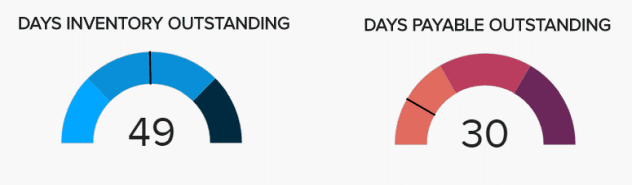 When to Use Gauge Charts
Gauge charts are also known as dial charts or speedometer charts. These charts use needles and colors to show data similar to a reading on a dial/speedometer, and they provide an easily digested visual. They are great for displaying a single value/measure within a quantitative context, such as to the previous period or to a target value. The gauge chart is often used in executive dashboards and reports to display progress against key business indicators. All you need to do is assign minimum and maximum values and define a color range, and the gauge chart will display an immediate trend indication.
What to AvoidGauge charts are great for KPIs and single data points. After that, they can get a bit messy. With only one data point, you can’t easily compare different variables. You also can’t trend data using gauge charts. All of this makes taking actionable insight from a gauge chart difficult. Furthermore, they take up a lot of space – if your live dashboard has precious real estate, it may not be most efficient to fill it with multiple gauge charts. You will likely get more bang for your buck using one chart to summarize multiple KPIs.
- Scatter Plot
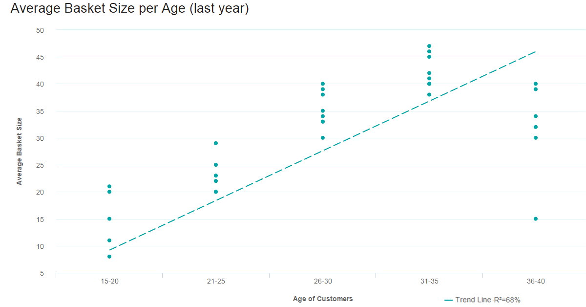 When to use Scatter Plots
Scatter plot is not only fun to say – it’s what you need when looking for the correlation in a large data set. The data sets need to be in pairs with a dependent variable and an independent variable. The dependent (the one the other relies on) becomes the y-axis, and the independent – the x-axis. When the data is distributed on the plot, the results show the correlation to be positive, negative (each to varying degrees), or nonexistent. Adding a trend line will help show the correlation and how statistically significant it is.
What to avoidScatter plots only work when you have a lot of data points and a correlation. If you are only talking about a few pieces of information, a scatter plot will be empty and pointless. The value comes through only when there are enough data points to see clear results. If you only have a little data or if your scatter plot shows no correlation at all, this chart has no place on your business dashboard.
- Spider Chart
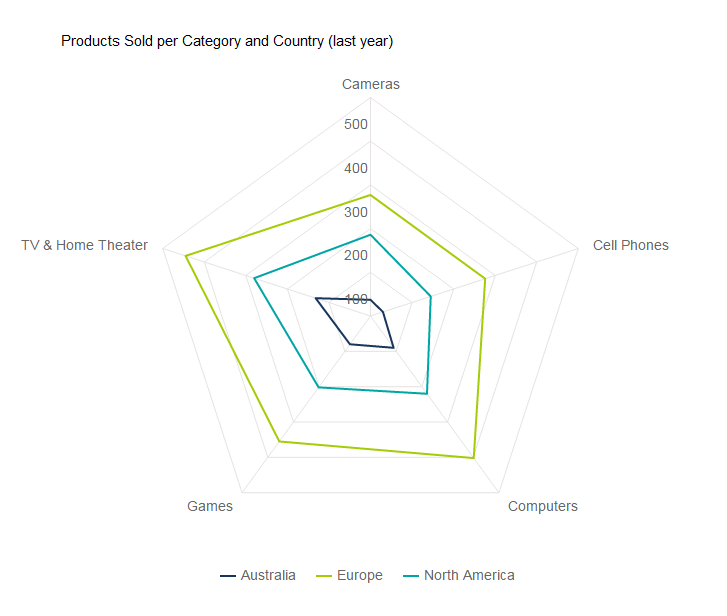 When to Use Spider Charts
Spider charts, or radar charts, are comparative charts used when multivariate data is displayed with three or more quantitative variables (aspects). This is useful when you want to evaluate two or more “things” using more than three aspects, all of which are similarly quantifiable. It’s certainly a mouthful, but it’s simple when you put it into use. Spider charts are great for rankings, appraisals, and reviews. For example, the three “things” we are comparing in our e-commerce example above are regions: Australia, Europe, and North America. The aspects we are comparing against are products sold are Cameras, TVs, Cell Phones, Games, and Computers. Each variable is being compared by how many units were sold – between 0 and 500. Europe is clearly outselling in all areas, and Australia is particularly weak in Cameras and Cell Phones. The concentration of strengths and weaknesses is evident at a glance.
What to avoidThis is not the easiest chart to pull off, but it really impresses when done correctly. Using this chart if you have more than five values in your dimension (five “things” to evaluate) makes it hard to read, which can make it pointless altogether. Whether you use solid lines or shaded areas, too many layers are difficult to interpret. Naturally, it is not a choice when you want to show time (the whole circular thing...).
- Tables
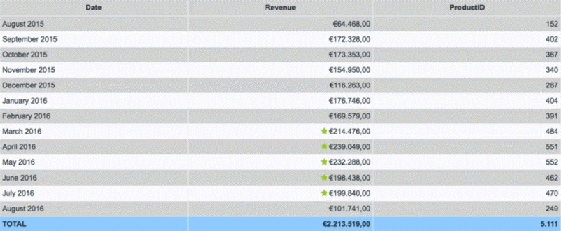 When to Use Tables
We know – tables aren’t technically a type of data visualization. But sometimes, you really just need a table to portray your data in its raw format. With a table, you can display a large number of precise measures and dimensions. You can easily look up or compare individual values while also displaying grand totals. This is particularly beneficial when your audience needs to know the underlying data or get into the “weeds.” Tables are also effective if you have a diverse audience where each person wants to look at their own piece of the table. They are also great at portraying a lot of text or string values.
Remember – just because you are using a table doesn’t mean it can’t be visually pleasing. You can use various colors, border styles, font types, number formats, and icons to highlight and present your data effectively.
What to AvoidThere are many reasons to use a table, but there are also many instances where different data visualization types are a better choice. It all comes down to our eyes and brain. Tables interact primarily with the verbal system – we read tables. This reading includes processing the displayed information in a sequential fashion. Users read down columns or across rows of numbers, comparing one number to another. The keywords here are reading, processing, and time. Tables take longer to digest.
Graphs, on the other hand, are perceived by our visual system. They give numbers shape and form and tell a data story. They can present an immense amount of data quickly and in an easy-to-consume fashion. If data visualization is needed to identify patterns and relationships, a table is not the best choice. Also, while it is fun to get creative with colors, formatting, and icons, make sure your formatting and presentation choices are increasing perception. Tables are hard enough to read as is!
- Area Charts
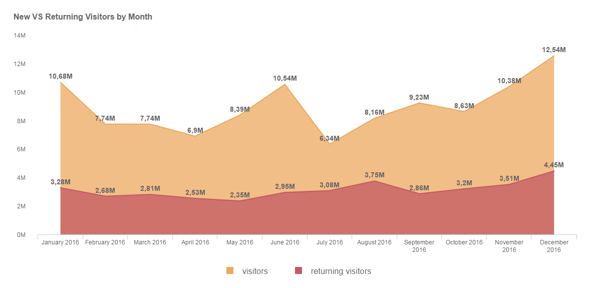 When to Use Area Charts
The area chart is closely related to the line chart. Both chart types depict a time-series relationship, show continuity across a dataset, and are good for seeing trends rather than individual values. That said, there are some key differences between the two. Because of these differences, “when to use area charts” does not equal “when to use line charts.”
Line charts connect discrete but continuous data points through straight line segments. This makes them effective for facilitating trend analyses. Area charts technically do the same, except that the area below the plotted lines is filled with color. In this case, an un-stacked area chart is the same thing as a line chart – just with more coloring. The problem you run into here is occlusion: when you start comparing multiple variables/categories in an unstacked area chart, the upper layers obscure the lower layers. You can play around with transparency, but after three variables, un-stacked area charts are hard to read.
This brings us to the most commonly used area chart: the stacked area chart. Like stacked bar charts, stacked area charts portray a part-to-whole relationship. The total vertical of a stacked area chart shows the whole, while the height of each different dataset shows the parts. For example, a stacked area chart can show the sales trends for each region and the total sales trend. There are two different stacked area chart types you can use to portray the part-to-whole relationship.
Traditional Stacked Area Chart:The raw values are stacked, showing how the whole changes over time.
Stacked Percentage Area Chart:Percentages are stacked to show how the relationship between the different parts changes over time. This is best used to show the distribution of categories as parts of a whole where the cumulative total is less important.
What to AvoidAs we hinted earlier, for the most part, you should stay away from un-stacked area charts. If you are just comparing 2-3 different variables that don’t obscure each other, then go ahead. But in general, they are often messy and don’t follow data visualization and dashboard design best practices. When it comes to stacked area charts, don’t use them when you don’t need to portray a part-to-whole relationship – use a line graph instead. Also, if you are trying to compare 7+ series, a stacked area graph becomes hard to read. In this case, you should once again turn to the line graph.
- Bubble Plots
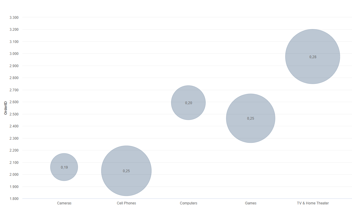 When to Use Bubble Plots
Bubble charts, or bubble graphs, are among the best data visualization graphs for comparing several values or sets of data at a glance. If you’re looking to show the relationship between different product categories, revenue streams, investment risks, costs, or anything similar, bubble charts or plots are incredibly effective.
For instance, our example bubble plot showcases the relationship between a mix of retail product categories, primarily the number of orders and profit margin.
Here, you can tell that the TV & Home Theater product category has the highest number of orders (around 3,000 as you can see from the number scale on the left) as well as the highest profit margin, and therefore, it is the biggest bubble on the chart. Comparatively, the camera category shows the lowest number of orders in addition to the smallest profit margin and naturally is the smallest bubble on the chart.
The bubble plot is extremely powerful for visualizing two or more variables with multiple dimensions. And here, the bigger the bubble, the higher the profit margin. Not only are bubble plots visually stimulating, but they are also incredibly effective when building a comparative narrative for a specific audience.
What to AvoidIt's difficult to go too far wrong with bubble charts, but the most common mistake with these types of data visualization graphs is focusing on varying the “radius” of the values rather than the “area” they take up on the chart. Doing so sometimes makes the bubbles on the plot disproportionate on the graph, making the information misleading at a glance. In short, your bubbles should be accurate in terms of size compared to the values. Get this right, and you’ll get the results you deserve.
Create Additional Values In Your Charts & Graphs With Modern Dynamic Text Boxes
When it comes to bringing your data visualization types to life, there are extra values or interactive elements you can add to your charts to make them more engaging and value-driven.
By using interactive dashboards to bring your data visualization graphs to life, you will make your presentations and initiatives all the more powerful, drilling your message home in a way that will benefit your organization as a direct result.
An interactive dashboard is a data management tool that analyzes, tracks, and monitors in greater detail, visually displaying critical business metrics while offering the opportunity to interact with data. In doing so, users can make more informed, data-backed, business-boosting decisions.
Of all of the beneficial features included within a robust interactive dashboard, dynamic text boxes or images are among the most effective.
Rather than wasting time and running the risk of encountering inaccuracies with your data, dynamic functionality means that you can scan KPI metrics intuitively while gaining automatic updates based on under or over performing values based on the filters you set. If your set value is under the specified criteria, a clear exclamation mark will show you that this benchmark needs your attention. If the set benchmark is performing well, a check-mark will provide a clear cue and let the viewer know that the value is under control. That means that no manual calculations are needed, and the dashboard will provide the necessary notifications.
To understand this in greater detail, here is a video based on our top 10 interactive dashboard features for your viewing pleasure:
Design-thinking In Data Visualization
When it comes to different data visualization types, there is no substitute for a solid design. If you take the time to understand the reason for your data visualization efforts, the people you’re aiming them at, and the approaches you want to take to tell your story, you will yield great results.
Here at datapine, we’ve developed the very best design options for our dashboard reporting software, making them easy to navigate yet sophisticated enough to handle all your data in a way that matters.
With our advanced dashboard features, including a host of global styling options, we enable you to make your dashboard as appealing as possible to the people being presented with your data.
Your part in creating an effective design for your data visualization graphs boils down to choosing the right data visualization types to tell a coherent, inspiring, and widely accessible story. Rarely will your audience understand how much strategic thought you have put into your selection of dashboards – as with many presentational elements, the design is often undervalued. However, we understand how important this is, and we’re here to lend a helping hand.
Aside from what we’ve covered in this guide, setting yourself up with a varied and value-driven set of questions will give you the best start to telling your data story the right way.
We may have covered this earlier, but it’s crucial, so we thought we should reiterate: Knowing who your audience is will show you what data you need, but understanding how they will use the data will help you decide which charts will accelerate the success of your data visualization efforts.
Is your audience going to be actively using the data featured within your dashboard? Or will they merely be viewing it to make more informed business decisions? Establishing this before you start designing your charts will help you decide which KPIs you want to showcase and which you want to highlight the most within your story.
If your audience will be actively using the data presented to them, perhaps as a team where each member may need to look at specific areas and drill down further, using more complex charts and global dashboard filters will work best.
If your dashboard is focused on showcasing a particular set of results, number charts and spider charts (which can look quite impressive) might be the best approach, with a small selection of more complex charts peppered into the mix to support your story.
To summarize, here are the top data visualization types you should know:
- Number Chart - gives an immediate overview of a specific value.
- Line Chart - shows trends and change of data over a period of time.
- Maps - visualizes data by geographical location.
- Waterfall Chart - demonstrates the static composition of data.
- Bar Graphs - used to compare data of many items.
- Pie Chart - indicates the proportional composition of a variable.
- Gauge Chart - used to display a single value within a quantitative context.
- Scatter Plot - applied to express relations and distribution of large sets of data.
- Spider Chart - comparative charts great for rankings, reviews, and appraisals.
- Tables - shows a large number of precise dimensions and measures.
- Area Chart - portrays a part-to-whole relationship over time.
- Bubble Plots - visualizes 2 or more variables with multiple dimensions.
Our approaches:
If you’d like to know more about in2in global automated advanced data analytics solution that can create and manipulate your data precisely for a meaningful business decision and make it usable for its intended purposes, please get in touch with us!